Say this in any car community and watch the reaction. The Porsche 911 is overrated on looks. Not overrated as a car. Not overrated as a driving experience. On looks specifically. The design that everyone calls timeless is, examined honestly, a design that has been coasting on familiarity for decades while the world gave it a free pass because of what the badge represents and what the car does when you push it.
That free pass has distorted the design conversation around the 911 so thoroughly that most people can't separate what the car actually looks like from what they know about it. And those are different things.
The Familiarity Problem
The 911 has looked essentially the same since 1963. Every generation has evolved the silhouette incrementally without breaking from the original. The rounded roofline, the rear engine hump, the wide rear haunches, the sloped hood. These have been refined across sixty years but the fundamental shape is unmistakably continuous from the original 901 to the current 992.
This consistency is universally praised as evidence of design greatness. It might actually be evidence of design stasis. When a shape becomes so embedded in cultural memory that any deviation from it is treated as heresy, it stops being evaluated as design and starts being evaluated as identity. The 911's shape isn't beautiful to most people who claim it is. It's familiar. Those are not the same thing and the car community has been confusing them for a long time.
Put a current 992 911 in a WhipJury faceoff against a voter who has no context for what a 911 is. No badge visible, no automotive background, no cultural weight attached to the shape. That voter, looking at the car purely as a visual object, often picks the Ferrari, the Lamborghini, or even a well-photographed Genesis G70 over it. Not always. But often enough that the "objectively beautiful" narrative doesn't survive contact with genuinely blind evaluation.
What the 911 Actually Looks Like
Set aside everything you know about it. Look at the shape.
The front end is low and competent but not dramatic. The hood line is clean but not distinctive. The headlights have been refined across generations but remain round and relatively conventional compared to the sharp graphic signatures that define the best contemporary designs. The side profile is dominated by that rear engine hump which creates an unusual proportion, short rear overhang but elevated rear deck, that is genuinely distinctive but not conventionally beautiful. It's the most identifiable element of the car and it's there because of an engineering constraint, the rear engine placement, not because a designer chose it for visual reasons.
The rear end is the 911's strongest angle and the one that earns the most honest praise. The wide, planted stance, the wraparound taillights on modern generations, the deck lid treatment. This is where the 911 looks genuinely great rather than just recognizable. If the entire car looked as good as its rear three-quarter view, the overrated argument would be harder to make.
The front three-quarter, the angle in which most cars are photographed and evaluated, is where the 911 is most vulnerable. The proportion is slightly odd. The front wheels sit far forward. The hood is short relative to the wheelbase. The result is a car that looks slightly nose-heavy in photos despite being famously tail-heavy in reality, which is a specific kind of visual irony that the 911's admirers rarely acknowledge.
The Comparison That Makes the Case
Put the current 992 911 Carrera next to a Ferrari 488 and ask someone with no automotive context which one looks more impressive. The 488 wins almost every time. It wins because its design was built around visual drama without the 911's engineering constraints. Mid-engine placement gave Ferrari designers proportions that work with conventional ideas of beauty: long hood, short deck, wide stance, a silhouette that reads as fast from every angle.
The 911 enthusiast's response to this is that the 488 is trying too hard. That the 911's restraint is what makes it great. That the design respects the driver rather than performing for bystanders. These are all genuine arguments and they're all arguments about the car's philosophy rather than its appearance. Confusing design philosophy with visual beauty is exactly the mistake that inflates the 911's design reputation beyond what the shape itself earns.
You can believe the 911's philosophy is superior to the Ferrari's without believing the 911 looks better. Plenty of people drive restrained, understated vehicles and understand that restraint is a choice rather than a limitation. The problem isn't choosing restraint. The problem is claiming that restraint is the same as beauty and using the 911 as the proof.
The GT3 Complication
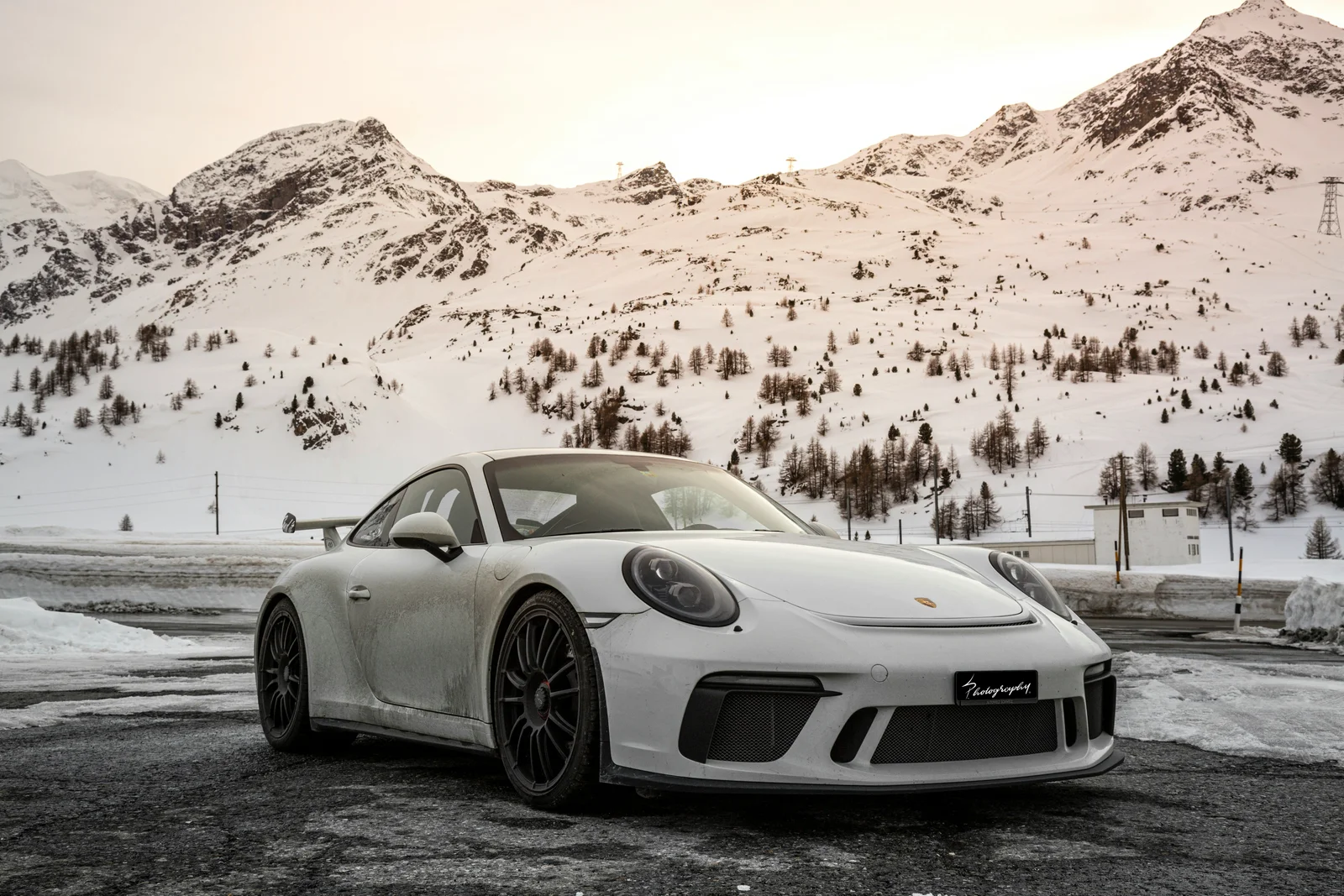
The 911 GT3 is where this argument gets genuinely complicated because the GT3 adds the visual elements the standard car lacks. The front splitter, the wide body, the massive rear wing, the lowered ride height. These additions transform the visual argument significantly. A GT3 in a committed color at the right angle is a genuinely beautiful car by almost any standard, not just by the standard of people who love Porsches.
But this is an argument for the GT3, not for the 911 design language. The GT3 looks better than the standard car because it's wearing a functional aero package that adds visual drama the base design doesn't have. If the 911 needed a wing and a front splitter to look as good as it does in GT3 form, that's an acknowledgment that the base design has visual limitations the performance package compensates for.
The 911 Turbo makes a similar case through its wider body and more aggressive stance. Both the Turbo and GT3 are significantly better looking than the base Carrera, which raises a question nobody in the Porsche community wants to answer directly: if the 911's design is so perfect, why does every performance variant improve it by adding more visual drama to it?
What the 911 Is Actually Great At
Immediate recognizability. No other car in production is as identifiable from as many angles in as many conditions. This is a genuine achievement and it's partly a design achievement, the silhouette is specific enough that it reads unmistakably even at night, even at distance, even partially obscured. Iconicity of this kind is rare and valuable and the 911 has earned it through sixty years of consistent identity.
Coherence. The 911 looks like one thing rather than multiple ideas assembled together. Every surface, every proportion decision, every detail serves the same overall argument. This coherence is visible and real and it's one reason the 911 reads better in person than in photos on average. The consistency of the design becomes apparent when you walk around it.
Aging. The 911 will look correct in twenty years. Probably in forty. The restraint that makes it less visually dramatic than its competitors in 2025 is the same quality that will make it look right rather than dated in 2045. This is a real advantage and it's worth something. The Ferrari 488 will look like a product of its decade. The 911 will look like a 911.
The Actual Verdict
The 911 is a great design. It's not the greatest design. It's not objectively the most beautiful sports car ever made. It's an exceptionally coherent, immediately recognizable, gracefully aging design that has been elevated beyond its actual visual merits by sixty years of cultural weight, performance reputation, and the understandable human tendency to love what you know.
That cultural weight is real. It affects how people experience the car and that experience has genuine value. But it's not the same thing as the shape being objectively superior to every alternative, and the car community's inability to distinguish between the two is what makes the 911's design reputation overrated.
The honest test is a blind faceoff. No badge. No context. Just the shape against other shapes. The 911 wins some of those. It doesn't win all of them. That's the real number and it's lower than the design mythology suggests.
Put the 911 in a faceoff on WhipJury and see what happens when the badge isn't part of the equation. The result might surprise you. It might not. Either way it's more honest than the conversation the car community has been having about it for sixty years.
Frequently Asked Questions

Jeffrey Wiley has spent more time than he'd like to admit thinking about what makes a car look right. He writes about automotive design, car culture, and the opinions people have strong feelings about. He lives in north Georgia.