Overrated doesn't mean ugly. It means the hype didn't match the reality. These are cars that got praised, won awards, moved units, and generated magazine covers, but when you really look at them, something is off. The proportions don't work. The details clash. The design made a promise it couldn't keep.
This isn't about the worst cars ever made. It's about the ones that got more credit than they deserved on looks alone. Ten cars, ten design verdicts. Rate them yourself on WhipJury and tell us we're wrong.
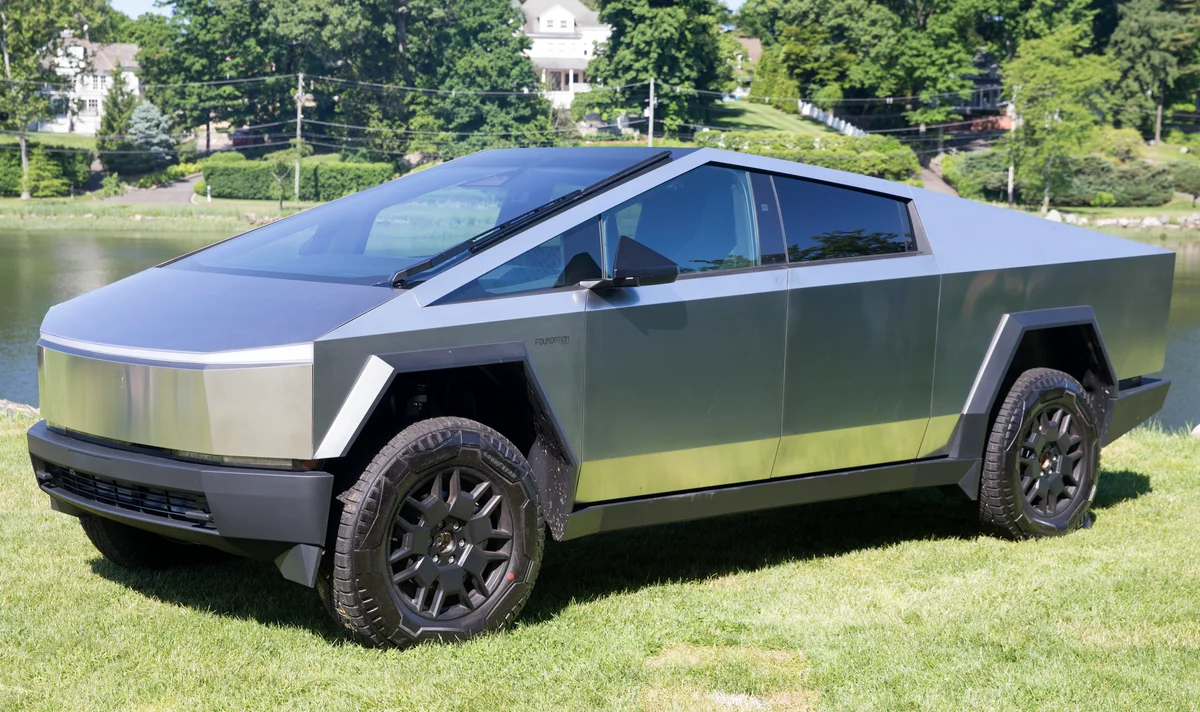
1. Tesla Cybertruck
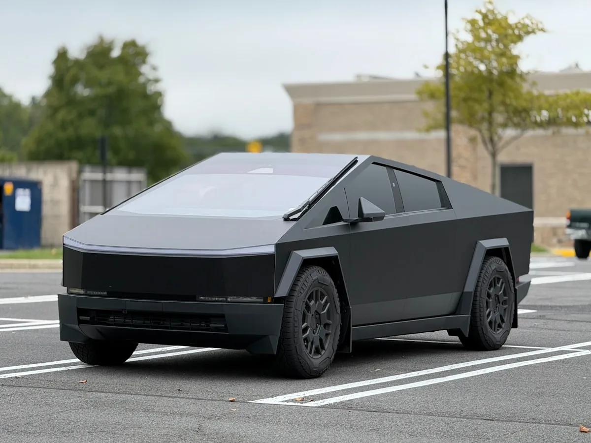
The Cybertruck gets points for audacity. It gets no points for execution. The stainless steel panels look unfinished in person, the proportions are awkward from any angle that isn't a press render, and the polarizing response it generates has been mistaken for cultural significance. Controversy is not the same thing as good design. A 4 on a generous day.
2. BMW M3 and M4 (G80/G82)
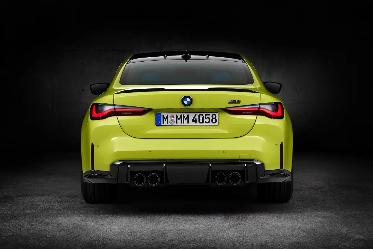
BMW performance cars used to be a slam dunk on looks. The E46, the E92, even the F80 were all easy 8s. Then the G80 showed up with those vertical kidney grilles and the whole conversation changed. The rest of the car is excellent. The front end looks like something a teenager drew in class. People defend it out of brand loyalty more than honest assessment.
3. Nissan Murano CrossCabriolet
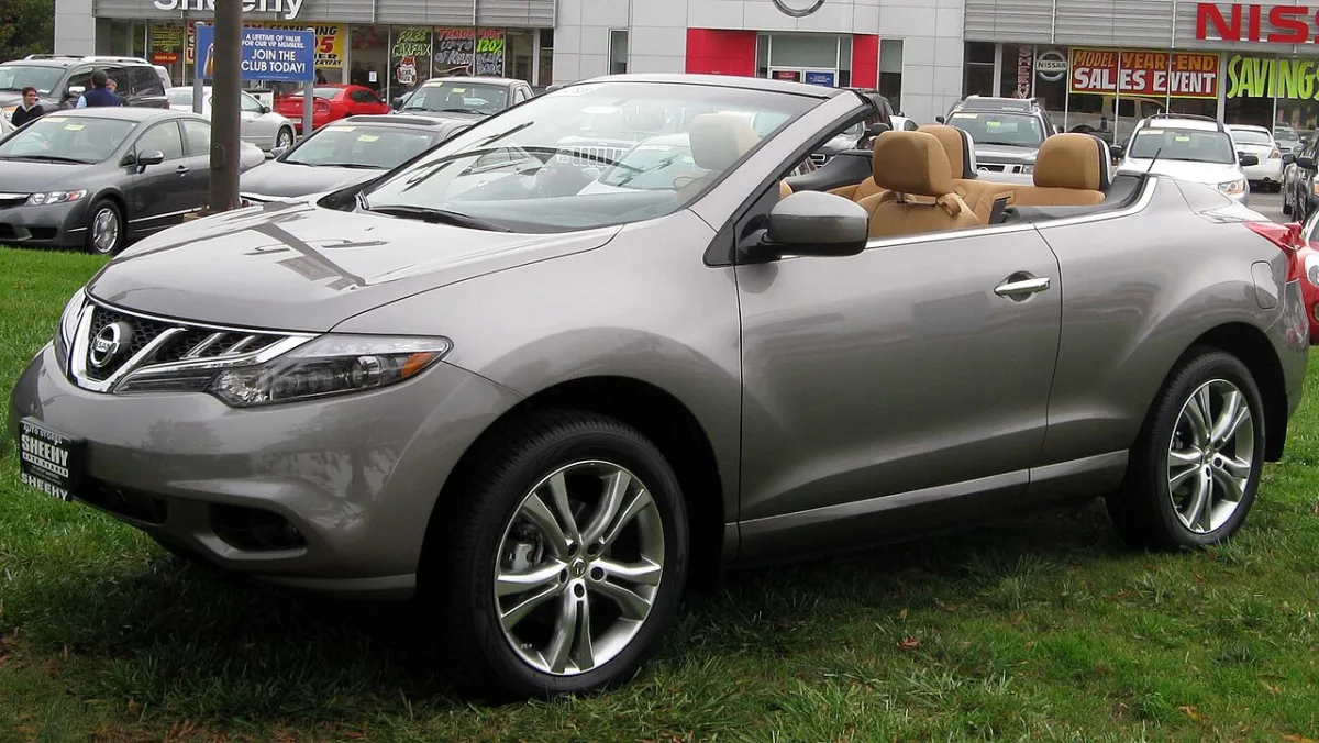
Nissan looked at a perfectly fine crossover, removed the roof, and somehow made both halves worse in the process. The CrossCabriolet looked like an SUV that had a disagreement with a convertible and neither won. It sold so poorly Nissan quietly ended it, but not before it made every best-of-worst list for years. A historic 2.
4. Jeep Cherokee (KL Generation)
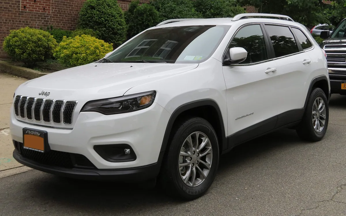
The Cherokee name carries serious weight. The KL generation squandered all of it with a front end that nobody agreed on internally, which is obvious because it looks like two different designers submitted two different front ends and Jeep used both. The slim upper lights, the round lower lights, the awkward grille placement. It sold well because the Cherokee name sold it, not because it looked good.
5. Lexus LC 500 (Rear End)
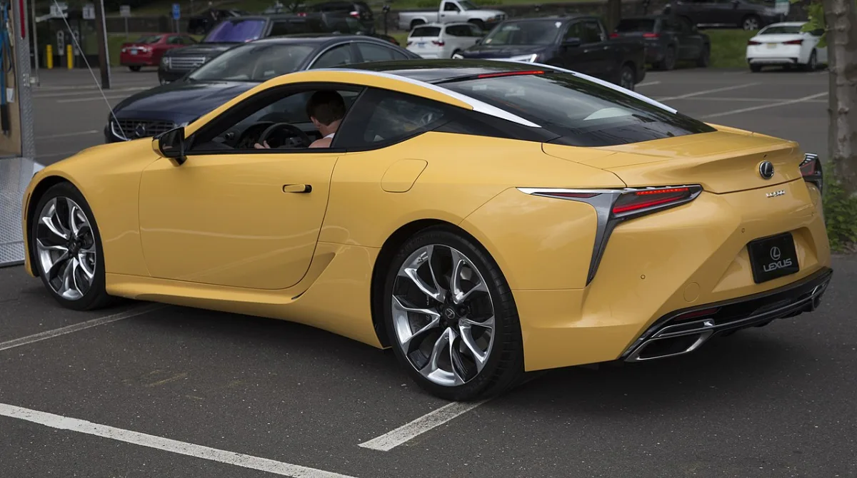
The LC 500 front end is genuinely spectacular. From the front, it might be a 9. Then you walk around to the rear and the whole thing falls apart. The trunk lid looks added as an afterthought, the taillights don't match the drama of the front, and the proportions get awkward from a three-quarter rear view. Half a great design is still half a design. It rates a 7 because the front earns it, but the rear pulls it down every time.
6. Toyota Mirai (Second Generation)
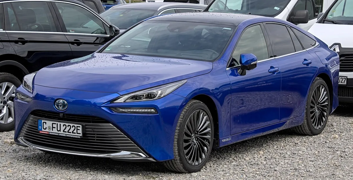
Toyota wanted the Mirai to signal the future of transportation. What they delivered was a car with an identity crisis. The second-generation is better than the first, but it still reads as a bloated version of the Prius with design cues stapled on top of each other. The hood, the roofline, the rear haunches — none of it flows. It looks like a concept car that made it too far down the production pipeline before anyone said stop.
7. Infiniti QX80
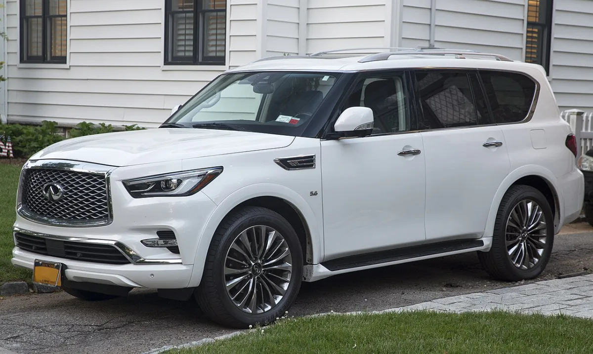
The QX80 costs close to $100K fully loaded and looks like it was designed to look expensive rather than to actually look good. The chrome is everywhere and all of it is aggressive in the wrong way. The front end is large for the sake of large. It commands attention the way a very loud person does, by volume rather than substance. For the price, it should be an 8. It's a 5.
8. Hyundai Ioniq 6
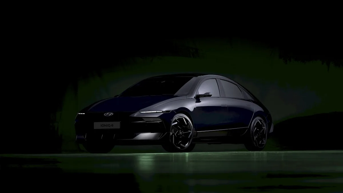
The Ioniq 5 looked like the future. The Ioniq 6 looked like someone tried to explain the Ioniq 5 to someone who had never seen it. The streamlined fastback shape works in theory but the execution left the car looking soft and undefined. The flush door handles and clean surfaces help, but the overall silhouette splits opinion every time. It won design awards, which says more about EV design standards in 2023 than it does about the car itself.
9. Dodge Hornet
Dodge had real momentum with the Charger and Challenger in terms of design identity. The Hornet threw most of that out. It's a rebadged Alfa Romeo Tonale underneath, and where the Tonale has Italian restraint, the Hornet has aggressive plastic addons that feel like costume jewelry. The crossed-flag badges and black accents can't paper over the fact that the base design wasn't built to carry the Dodge attitude. It looks like it's trying and that's the problem.
10. Lincoln Aviator
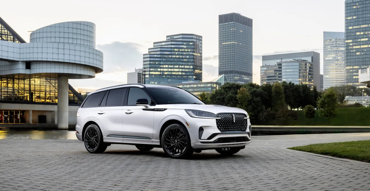
The Aviator is not a bad-looking car. It's a safe-looking car wearing a luxury price tag. Lincoln's design language is refined and inoffensive to the point of invisibility. The Aviator could be any premium three-row SUV from any angle. For a brand trying to reestablish itself as a serious luxury player, it needed to be an 8. It's a 6 that gets called an 8 in press releases.
The Bottom Line
Overrated design is everywhere in the auto industry because hype, brand loyalty, and marketing move faster than honest assessment. The cars on this list all had something going for them. Some sold well. Some won awards. But put them on WhipJury next to their competition and let the ratings speak for themselves.
Think one of these deserves more credit? Think we left something off? Head to WhipJury and make your case with a rating. The jury is always open.

Jeffrey Wiley has spent more time than he'd like to admit thinking about what makes a car look right. He writes about automotive design, car culture, and the opinions people have strong feelings about. He lives in north Georgia.