Pick any car you know well. Now imagine it in five different colors. It is genuinely a different car each time. Not just a different shade but a different personality, a different price bracket in some cases, a different argument about what kind of person drives it. Color is doing more work on a car than on almost any other designed object, and most buyers underestimate how much the choice matters until they see their car in the wrong one.
Color Changes What the Light Does
The most technical reason the same car looks different in every color is physics. Light behaves differently depending on the surface it hits. A dark color absorbs light, which flattens surface detail but deepens shadow. A light color reflects light evenly, which makes every curve and crease visible. A metallic finish scatters light in multiple directions, giving the body a sense of depth and movement. A matte finish diffuses light so softly that the car looks almost two-dimensional, which can be either striking or dull depending on the design.
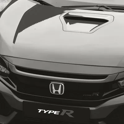
A car with complex surface sculpting, deep character lines, and multiple body planes will look completely different depending on which of these effects is in play. The same door panel that looks dramatic and muscular in dark navy can look almost flat in a bright white. The same hood that looks expensive in a deep pearl can look ordinary in a solid mid-range color with no metallic content.
Dark Colors Simplify, Light Colors Reveal
This is the most consistent pattern in how color affects car design. Dark colors reduce visual complexity. They merge body lines into shadow and present the car as a shape rather than a collection of surfaces. This is why a car that looks busy or overdone in silver often looks much more resolved in black. The darkness absorbs the noise and what remains is the silhouette.
Light colors do the opposite. White and light silver expose everything the designers built into the body. Every surface transition is visible. Every crease catches light. Every proportion reads clearly. This is why white is the best color for showing off a truly well-designed car and the worst color for hiding a mediocre one. There is nowhere to hide in white.
Warm Colors Read as Aggressive, Cool Colors Read as Premium
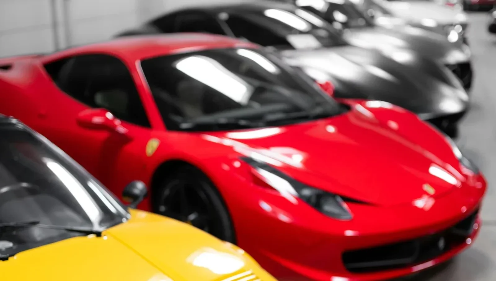
Red advances visually. It is the color the eye moves to first in a scene, which means a red car looks closer, faster, and more aggressive than the same car in a receding color. This is why red has a century-long association with sports cars. It amplifies the intention of aggressive design and it translates that aggression even on a car that is not particularly fast.
Cool colors, blues, greens, grays with blue undertones, read differently. They suggest restraint, precision, and premium positioning. A deep midnight blue on a large luxury sedan reads as expensive and serious in a way that red never quite achieves. Cool colors also tend to make a car look larger, which helps SUVs and full-size vehicles but can make small cars look heavier than they should.
Neutral colors, grays, silvers, white, are the most popular globally because they offend no one and they photograph well in every light condition. They are also the most forgettable, which is why enthusiasts consistently rate them lower even while the mass market consistently chooses them.
The Proportion Effect
Color changes perceived proportion in ways that matter more than most buyers realize. A two-tone roof in a contrasting color, black roof on a white body for example, visually lowers the roofline and makes the greenhouse appear smaller. This is why the black roof option on small premium hatchbacks became so popular. It is not just a style choice. It is a proportion correction that makes the car look sportier without changing a single body panel.
Similarly, a color that matches the bumpers to the body makes a car look longer and more cohesive. A contrasting bumper color, common on budget cars where the bumpers are painted separately, breaks the visual flow and makes the car look segmented. This is one reason painted bumpers became a premium feature worth paying for. The visual difference is significant even if the mechanical difference is zero.
Why Manufacturers Photograph Certain Colors
Pay attention to which colors appear most often in manufacturer press photography and you will notice a pattern. Dark metallics, deep blues, rich reds, and pearl whites dominate. Beige, silver, and gray, despite being the bestselling colors in most markets, almost never lead a press campaign. Manufacturers know which colors make their cars look best and they use those colors to establish the design in the public imagination, even when most buyers will ultimately choose something more conservative.
The car you fall in love with in a press photo is often doing so much of its visual work through color that the same car in the beige you actually order can feel like a disappointment even before it arrives. This is not a design failure. It is a photography reality that buyers rarely account for at the point of purchase.
The Color You Would Never Order
Almost every car has a color in its palette that the design team clearly intended as the hero option, the color the car was designed around and that brings out everything the body is trying to say. It is usually not the best seller. It is usually the color that seems like too much of a commitment in the showroom but looks completely right in person on the actual car.
Porsche buyers know this about Paint to Sample. BMW buyers know it about individual colors. Genesis buyers who ordered Uyuni White know it. The color that looks bold on a configurator screen often looks inevitable in a parking lot, and the safe gray that seemed reasonable online can look like an apology for the design it covers.
How This Affects Your WhipJury Rating
When you rate a car on WhipJury the color in the photo is doing real work on your score. A well-chosen press photo in a flattering color can pull a 6 car up to a 7 in your initial reaction. The same car photographed in a budget gray under flat light might rate two points lower before you even consciously assess the design.
The best raters account for this. They try to separate what the shape is doing from what the color is doing. They ask whether the car would still be interesting in white, which strips away most of the color effect and forces the design to stand on its own. If the answer is yes, the rating holds. If the answer is that the color was doing all the work, that is useful information too.
Rate the same car in different colors on WhipJury and watch how much the numbers move. The gap will tell you everything about how much work color is doing.

Jeffrey Wiley has spent more time than he'd like to admit thinking about what makes a car look right. He writes about automotive design, car culture, and the opinions people have strong feelings about. He lives in north Georgia.