
You can tell within two seconds. You see a car across a parking lot and something about it reads money before you even know the make. It's not always the badge. It's not always the size. It's a collection of design decisions that, when done right, communicate value without saying a word.
Understanding what those cues are is the difference between rating a car on gut feeling and rating it with actual criteria. Here's what to look for.
Proportions Come First
Before any detail registers, the overall shape does. Expensive cars tend to have long hoods, short overhangs, and a low roofline relative to the wheel arches. This is the classic GT proportion and it signals performance and intent before the engine even starts.
Cheap cars tend to have tall greenhouse areas, short hoods, and overhangs that look like the body was stretched to fit a larger platform. The proportions feel economized. Expensive proportions feel like the design was never compromised for practicality, even when it was.
The Wheels Fill the Arches
This is one of the fastest tells. On a well-designed expensive car, the wheels look like they belong exactly where they are. The arches are tight, the gap between tire and arch is minimal, and the stance looks planted. The wheel size relative to the body reads as intentional rather than an afterthought.
On budget cars, the wheels often look too small for the arches. There's too much gap. The car looks like it's sitting on top of its wheels rather than around them. No amount of styling elsewhere fixes this impression.
Flush Surfaces and Tight Panel Gaps
Run your eye along the side of a luxury car and the surfaces are smooth and continuous. The doors, fenders, and quarter panels flow into each other with minimal interruption. Panel gaps are even, narrow, and consistent all the way around.
On cheaper cars the gaps are wider, sometimes uneven, and the panels themselves often have a slight waviness under direct light. It's a manufacturing precision issue as much as a design one, but it reads as cheap from a distance. Flush door handles take this further. When the hardware disappears into the surface, the whole car looks more refined.
The Headlights Do Real Work
Headlight design has become one of the primary ways brands signal tier. Expensive cars have slim, precisely shaped lighting signatures that feel like they were drawn by hand. The daytime running lights have a graphic quality. The overall light unit is integrated deeply into the front fascia rather than sitting on top of it.
Budget headlights tend to be rounder, simpler, and placed rather than designed. They look like a functional component. Premium headlights look like a design decision. The difference is immediately visible and it sets the tone for everything else on the front end.
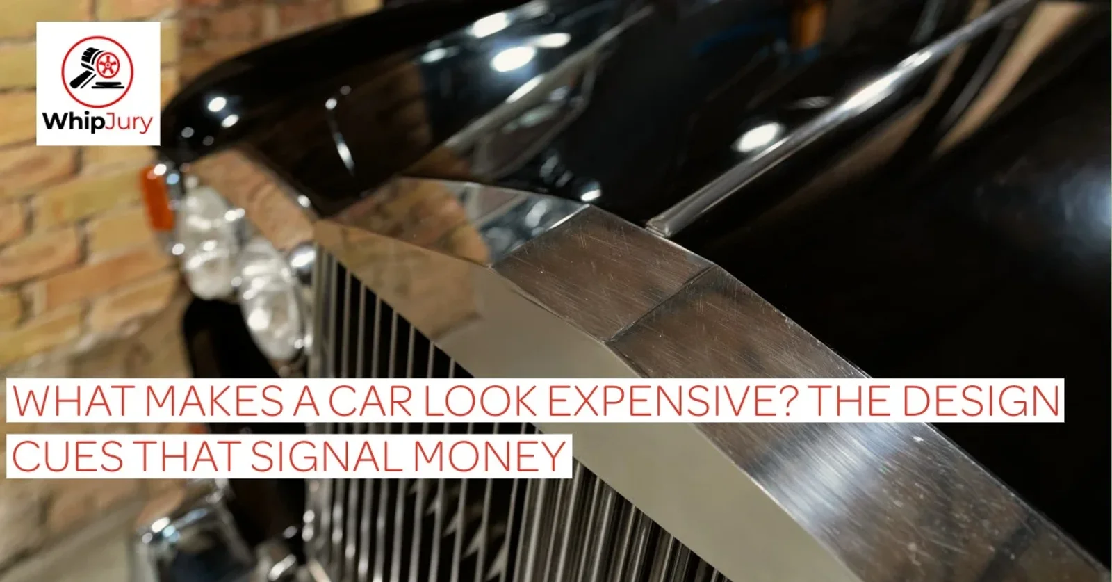
Chrome Used Sparingly and Deliberately
Chrome does not automatically signal luxury. Cheap chrome applied everywhere signals the opposite. On genuinely expensive cars, chrome or bright trim appears in specific locations to define edges, frame openings, or draw the eye to a design feature. It has a purpose.
When chrome is used as decoration, slathered across grilles, door handles, mirror caps, and lower trim in an attempt to look upscale, the effect backfires. It reads as trying too hard. Real luxury uses chrome like punctuation, not wallpaper.
A Coherent Design Language Front to Rear
One of the clearest signs of an expensive car is that it looks like one team designed the whole thing with a single idea in mind. The character lines that start at the front resolve cleanly at the rear. The light graphics front and back feel related. There is a visual thread that runs through the whole car.
Cheaper cars often look like the front and rear were designed separately. The rear end feels like an afterthought. The taillights don't relate to the headlights. Walk around a car before you rate it. The rear tells you everything about whether the design was fully committed to.
Shadow and Surface Complexity
Expensive car bodies are sculpted to catch light and create shadow in specific ways. The character lines are designed to produce a long highlight that runs the length of the car, giving the surface drama and depth. Stand back from a well-designed car in sunlight and the body almost appears to glow along those lines.
Flat surfaces with no sculpting look cheap because they reflect light uniformly. There's no depth, no movement, nothing that rewards a second look. Surface complexity is a direct indicator of how much the designers cared and how much the brand was willing to spend on tooling to achieve it.
The Greenhouse Ratio
The greenhouse is the glass area above the beltline. On expensive cars it tends to be smaller relative to the overall body. The beltline sits higher, the windows are narrower, and the car looks more planted and aggressive. It communicates that structural rigidity was prioritized over interior light. That's a luxury trade-off and it reads immediately as intentional.
Tall greenhouses with large windows read as practical and economical. They maximize interior space, which is exactly what a family car needs and exactly what a car that wants to look expensive avoids signaling.
Putting It to Use on WhipJury
Next time you rate a car on WhipJury, run through these cues before you pick a number. Does the car have real proportions or does it look compromised? Do the wheels fill the arches? Does the front end relate to the rear? Is the chrome earning its place or just covering surface area?
The cars that score highest over time are almost always the ones that get most of these right, regardless of price. That's what makes a high Whip Score meaningful. It means the design holds up to scrutiny, not just a first glance.
Rate a car on WhipJury and see how your eye holds up against the crowd.