You've seen it happen. The press photos come out and the car looks extraordinary. Then you see one in a parking lot and something is off. The proportions feel different. The color is less interesting. The details that looked sharp in the photos look ordinary in person. This happens with enough consistency that it can't be coincidence, and it isn't. There are specific, technical reasons why cars look better in photos than in person, and understanding them changes how you evaluate any car you haven't seen in the metal.
The Camera Compresses Distance and That Helps Proportions
Professional car photography almost always uses a telephoto or mild telephoto lens, typically in the 85mm to 200mm range on a full-frame camera. Telephoto lenses compress the distance between near and far elements in a frame. On a car this means the front and rear of the vehicle appear closer together than they actually are, which makes the wheelbase look shorter relative to the overall length and tightens the proportions visually.
In person your eye sees the car with natural perspective. The front is closer to you and appears larger. The rear recedes. The actual wheelbase and overhangs read at their real length. On most cars, particularly crossovers and SUVs, the telephoto compression in press photos is making the proportions look better than they are in real life. The car looks more planted, more balanced, and less tall in a telephoto shot than it does when you're standing next to it.
This is why people stand next to a new car they've been anticipating and feel vaguely let down without being able to say exactly why. The car is the same car. The perspective changed and the proportions they fell in love with were partly a product of the lens.
Press Photos Are Taken at the Best Possible Moment
Professional automotive photographers shoot at golden hour or in controlled studio environments because those conditions produce the most flattering light for almost every car. Golden hour light is directional and warm. It rakes across body surfaces at a low angle and creates the highlight and shadow play that makes surface sculpting visible and dramatic. Every character line does its best work in golden hour light. Every subtle curve generates a long, elegant highlight.
The car you see in a parking lot is being lit by whatever the sky is doing that afternoon. Flat overcast light. Harsh midday sun that creates blown-out highlights and flat shadow. The diffuse glow of a cloudy day that removes all surface drama. None of these are good conditions for a car's design and most cars spend most of their existence in exactly these conditions. The press photo was the car at its best. The parking lot is the car the rest of the time.
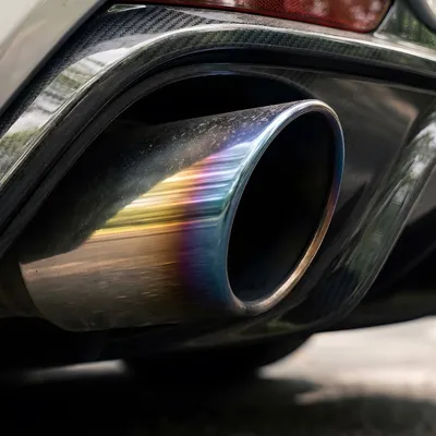
Add to this that press shoots are typically done on cars that have been detailed to a level most owners never achieve. Every panel surface polished to perfect clarity. Every gap blown out with compressed air. Tires freshly dressed. Wheels spotless. The physical condition of the car in press photos is as good as that car will ever look, photographed under conditions designed to maximize it.
Color Behaves Differently on Screen Than in Person
Monitor calibration, brightness settings, and the specific display technology you're using when you see a press photo all affect how the color reads. Car manufacturers also submit press photos that have been professionally color-graded to make the vehicle's paint look its absolute best. The red is more saturated than your monitor's default would show it. The metallic flake is more visible. The deep blue has more depth.
In person, paint responds to ambient light in ways that a photograph condenses into a single moment. A pearl white that shifts between warm cream and bright white as you walk around it in person reads as a single flat white in a photo unless the photographer specifically captures multiple angles in multiple light conditions. A dark green metallic that looks almost black in shade and bright emerald in direct sun looks like one consistent color in any single photo. The dynamic quality of good paint is one of the things photography compresses out of the experience.
Some colors are dramatically better in person than in photos for exactly this reason. Soul Red Crystal on a Mazda CX-5 looks good in photos and genuinely surprising in person because the three-layer formula shifts in ways that no single image captures. Porsche's Frozen Blue Metallic reads as a pleasant medium blue in photos and an extraordinary color in changing light. If you've only ever seen a car in photos you've missed half of what some colors are doing.
The Background Is Doing More Work Than You Think
A car shot against a clean mountain road with a dark treeline behind it looks different from the same car in a suburban parking lot. Not because the car changed but because the background is providing tonal contrast, visual context, and a frame that makes the car the clear subject of the image. In person there's no frame. There's no curated background. The car exists in whatever environment it actually lives in, competing for attention with everything around it.
Press photographers spend significant time on location scouting and background selection. The backgrounds in great car photos are not accidental. They're chosen specifically to complement the car's color, provide appropriate tonal contrast, and reinforce the design's intended atmosphere. An angular, aggressive sports car shot against brutalist architecture. A luxury sedan shot against glass and steel. An off-road vehicle shot with something rugged behind it. These pairings are deliberate and they shape how the car reads before the viewer consciously assesses the design.
Scale Is Harder to Read in Photos
Without a human figure for reference, cars in photos are ambiguous in size. A compact crossover and a full-size SUV can read similarly in a photo if the composition fills the frame the same way. In person the size difference is immediate and it changes the design assessment completely. Details that look crisp and tight on a compact car can look undersized and lost on a full-size version of a similar body. The wheel size that looked correct in the photo looks too small when you're standing next to the actual wheel.
This is one reason why sports cars sometimes disappoint in person when people have only seen them in photos. The Mazda MX-5 is tiny. The press photos don't convey tiny. They convey low and purposeful and athletic. All of those things are true of the MX-5 but the physical scale of the car, which is part of its character, is the thing that surprises people most when they stand next to one. Scale has no equivalent in a photo unless the photographer deliberately provides a reference.
When the Reverse Is True
Some cars are better in person than in photos and it's worth knowing which ones. These are typically the cars whose design qualities are dynamic rather than static. Paint that shifts in changing light. Proportions that work better at natural perspective than at telephoto compression. Details that reward close inspection more than distant viewing.
The Alfa Romeo Giulia is consistently better in person than in photos. The proportions are slightly unusual in a way that telephoto compression makes look awkward but natural perspective makes look purposeful. The surface development reveals more the closer you get. The Giulia rewards inspection. Photos rarely do it justice.
The BMW 3 Series in its best colors is similar. The M Sport body kit reads as add-on in photos and integrated in person once you see how the lower body panels relate to the wheel arch graphics at close range. The Mercedes C-Class in Selenite Grey is a color that photographs as a plain medium gray and looks extraordinary in direct sunlight when the metallic flake activates.
These are the cars that tend to be underrated in faceoffs because faceoff photos are rarely taken in optimal conditions and the car's best qualities don't survive the compression from three-dimensional experience to a flat image on a phone screen.
What This Means for WhipJury Submissions
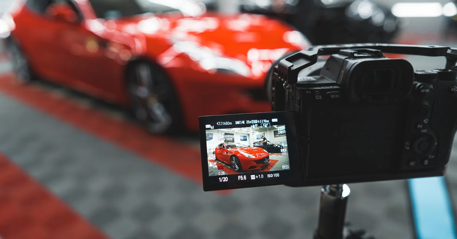
If your car looks better in person than in photos, your faceoff results are underrepresenting what you actually have. The solution isn't to accept the gap. It's to close it. Golden hour light. Telephoto or mild telephoto compression if you're shooting with a dedicated camera. A background that provides context and contrast rather than competing with the car. These choices close the gap between the in-person experience and what the faceoff voter sees.
If your car looks better in photos than in person, that's useful information too. It means the design is dependent on specific conditions to make its argument, which is a design quality assessment worth knowing. Cars that look great in any light, from any angle, in any condition are the ones with truly strong underlying design. Everything else is context-dependent to some degree.
Take the photo that closes the gap. Then submit it to WhipJury and find out what happens when the conditions are as good as the car deserves.
Frequently Asked Questions

Cam Walsh has been obsessing over cars since before he could drive one. Based out of Atlanta, Cam covers automotive design, car culture, and the eternal debate over which whips actually look the part.