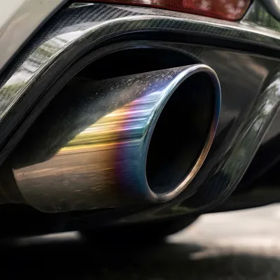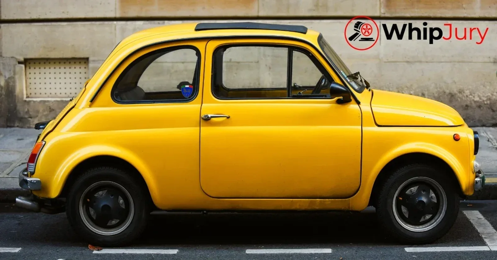
White is demanding. Black is unforgiving. But neither of those is the hardest color to wear on a car. The hardest color is yellow. Not orange, not lime green, not any of the other colors people think of when they imagine a car color that requires commitment. Yellow specifically. And the reason has everything to do with what yellow does to proportion, light, and the viewer's eye before any design quality is even registered.
Why Yellow Is Different
Every other color on a car either advances or recedes visually. Red advances. Blue recedes. Black flattens. White reveals. Yellow does something none of the others do: it vibrates. The eye processes yellow at a frequency closer to its peak sensitivity than any other color in the visible spectrum. It's the first color the human eye detects in peripheral vision. It's why school buses and traffic signs are yellow. The eye cannot look at yellow passively. It reacts to it.
On a car this means yellow is working on the viewer before any conscious assessment starts. The proportion, the stance, the surface design. None of those get processed first. Yellow gets processed first. And if the car isn't strong enough to hold its own once the initial reaction settles, the yellow becomes the whole story. You remember the color. Not the car.
The Cars That Survive Yellow
A short list. The Porsche 911 in Racing Yellow is the clearest example of a car that doesn't just survive yellow but uses it. The 911's shape is so deeply established in the visual memory of anyone who cares about cars that yellow doesn't overwhelm the design. It amplifies it. The silhouette is still the first thing you read. Yellow just makes you read it louder.
The Lamborghini Huracán in Giallo Midas. The McLaren 570S in Volcano Yellow. The Ferrari F8 in Giallo Modena. These cars survive yellow for the same reason. The body surfaces are aggressive enough and specific enough that the design competes with the color for attention and wins. You see the car and the color together rather than the color swallowing the car whole.
The Chevrolet Corvette C8 in Accelerate Yellow is an interesting case because the C8's mid-engine redesign finally gave the Corvette the proportions to justify yellow. Previous generations in yellow looked like someone had chosen the wrong color for a well-intentioned car. The C8 in yellow looks like the design was building toward that combination all along. When a car earns yellow it's always because the underlying design is confident enough to share the spotlight.
At the opposite end of the price spectrum, the Mazda MX-5 in Racing Orange, which reads more yellow in direct light than the name suggests, is one of the better examples of an affordable car wearing a demanding color with full confidence. The MX-5's proportions are correct enough that any saturated color lands well. Yellow rewards correctness. The MX-5 is correct.
What Yellow Destroys
SUVs. Almost universally. The tall greenhouse, the upright stance, the practical proportions that dominate the segment. Yellow on an SUV doesn't read as bold. It reads as an attempt to compensate for the fact that the body isn't doing enough visually. The Jeep Wrangler is the one exception and it works because the Wrangler's design language is so committed to utility that yellow becomes part of that commitment rather than a contradiction of it. A yellow Wrangler looks like a tool. A yellow Ford Explorer looks like someone made a mistake at the dealership.
Sedans are harder with yellow than people expect. The instinct is that a yellow performance sedan, something like a BMW M3 Competition in Sao Paulo Yellow, should work because the car is performance-oriented and the color is bold. It's more complicated than that. The M3 in Sao Paulo Yellow is divisive specifically because the four-door body adds visual weight at exactly the places where yellow needs the design to be tight and resolved. The current G80 generation M3's front end in yellow is a lot. Some people find it exciting. Many find it overwhelming. The color exposed a tension in the design that darker colors absorb.
The worst yellow applications tend to involve cars that were offered yellow as a trim-level signal rather than a design statement. Entry-level hatchbacks in pale yellow to suggest they're fun and youthful. Compact crossovers in washed-out yellow to differentiate their base trims. These colors are neither saturated enough to commit nor neutral enough to recede and they produce the specific visual outcome that makes yellow's reputation so complicated. A half-committed yellow looks like a car that wanted to be interesting and didn't quite get there. The color communicates uncertainty and a car should never communicate uncertainty.
The Pale Yellow Problem
Worth separating out entirely because pale yellow and saturated yellow are not the same design challenge. Saturated yellow is demanding but honest. It commits. You know exactly what it is and you react to it clearly. Pale yellow, the cream-adjacent, washed-out, almost-white yellows that appear periodically on production cars, is a different category of failure.
Pale yellow looks like a color that wanted to be white and didn't finish the journey. It doesn't have the visual authority of pure white and it doesn't have the energy of real yellow. It sits in a perceptual middle ground where the eye registers it as slightly off rather than specifically anything. In photos, particularly in flat light, pale yellow can read as a discolored white, which is the worst possible read for any exterior color. Cars look like they've yellowed with age rather than been intentionally painted.
The Honda e in Charge Yellow avoided this by choosing a warm, saturated pale yellow that stops just short of full saturation while maintaining enough chroma to read as intentional. It worked on that specific car because the Honda e's round, retro proportions are compatible with a friendly, approachable color. Move the same color to a larger, more angular car and the friendliness becomes awkwardness fast.
The Runner-Up: Brown
If yellow is the hardest saturated color, brown is the hardest neutral. Brown occupies the specific visual territory where a color that should work as a sophisticated alternative to black or gray ends up reading as dated or accidental depending on how the formula is calibrated. Deep espresso brown with a gloss metallic finish on a luxury sedan can look extraordinary. The same car in a mid-range matte brown looks like it belongs in 1978.
Porsche's Umber Metallic is probably the most successful brown formula in current production. It reads as deliberately sophisticated rather than accidentally dated, which requires getting the depth and undertone exactly right. BMW's Sparkling Copper has a similar quality. These browns work because they're warm without being muddy and they have enough metallic content to move in light rather than sitting flat. Most manufacturer browns don't achieve this and the result ends up on lists of worst car colors rather than best.
What Faceoffs Reveal About Difficult Colors
Yellow cars produce some of the most consistent faceoff patterns on WhipJury. A saturated yellow on a sports car or supercar wins faceoffs at a significantly higher rate than the same car in a conservative color. The visual energy of yellow transfers directly into faceoff performance when the design can carry it. The same color on an SUV or family sedan performs worse than the vehicle would in any other color, including colors that should theoretically be less interesting.
Brown cars are the most underrated in faceoffs. A well-calibrated dark brown metallic on a car with strong surface design consistently underperforms in initial reaction and overperforms in repeated exposure. Voters who see a brown car multiple times across different faceoffs rate it progressively higher. Brown is a slow color. It reveals itself across multiple looks rather than on first contact, which is a liability in a faceoff format where first impressions drive most votes but an asset in the real world where you live with the car every day.
The hardest color to pull off is also often the most rewarding when the car is right for it. A 911 in Racing Yellow in your driveway every morning is not the same experience as a 911 in silver. The color either earns its difficulty or it doesn't. Find out where your car lands on WhipJury.

Cam Walsh has been obsessing over cars since before he could drive one. Based out of Atlanta, Cam covers automotive design, car culture, and the eternal debate over which whips actually look the part.