
White is the best-selling car color in the world. Has been for over a decade. Buyers choose it because it's safe, resells well, hides dust reasonably, and looks clean on a configurator screen. None of those are design reasons. And design is exactly what white tests, mercilessly, every time a car wears it.
Black is forgiving. It absorbs light, flattens surfaces, and turns a mediocre body into a readable silhouette. White does the opposite. It reflects everything. Every surface transition, every proportion decision, every panel gap, every detail the designer got slightly wrong. White puts all of it on display with nowhere to hide. Most cars fail that test and their owners have no idea because they never saw the car in a color that would have shown them what was wrong.
What White Actually Does to a Car
Light bouncing off a white surface travels in every direction equally. That means every curve, every crease, and every surface transition generates its own highlight and shadow simultaneously. On a well-designed body this creates visual richness. Each panel reads individually and the transitions between them read as deliberate. The car looks like it was designed with intention at every square inch.
On a poorly designed body, the same physics work against it. Flat panels with no sculpting look like printer paper. Weak character lines that look acceptable in silver become invisible in white, leaving the surface with nothing to say. Awkward transitions between panels that black would have merged into shadow now sit in full light, asking to be noticed, demanding that the design justify them. White removes the visual noise that other colors provide and replaces it with silence. If the design has something to say in that silence, white is spectacular. If it doesn't, white is brutal.
The Porsche 911 in Carrara White is one of the most beautiful factory color combinations available on any car. The white reveals the 911's surface development completely. Every subtle curve in the rear haunches, the precise taper of the roofline, the relationship between the front fender and the hood. All of it reads in white in a way that darker colors partially obscure. The design earned white because the design has enough happening beneath the surface that white's revelatory quality works in its favor.
The same color on a Toyota RAV4 reveals something different. That the body surfaces are largely flat. That the character lines are shallow and widely spaced. That the overall proportion is upright and utilitarian in ways that white's clinical quality only emphasizes. The RAV4 isn't a bad car. It's a car that white exposes honestly, and honest in this case means unflattering.
Not All White Is the Same
This is where the conversation gets specific in ways most buyers never think about. There's flat white, pearl white, metallic white, satin white, and various proprietary formulations that manufacturers guard like trade secrets. They behave completely differently on a body and they're not interchangeable.
Flat white is the most unforgiving. No flake, no depth, no movement in different light. It reads the same at noon as it does at dusk. Any imperfection in the panel surface shows immediately because there's nothing in the paint to scatter light and soften edges. Flat white on a car with excellent panel quality and strong surface design is clean and authoritative. On anything else it looks cheap fast.
Pearl white adds depth through mica flakes that scatter light at different angles. The surface appears to shift slightly as you move around the car, which creates visual interest that flat white lacks entirely. Genesis's Uyuni White is a pearl formula developed specifically to complement the G80's surface development. The way it moves in light is part of the design intent, not an accident of color selection. That's white being used as a design tool rather than a default choice.
BMW's Alpine White has been a reference standard for years because it sits in a specific tonal range that works with the company's angular design language without either overexposing the surfaces or softening them. It's warm enough to avoid the clinical coldness of pure white but neutral enough to let the body do the work. Getting that tonal calibration right is harder than it sounds and most manufacturers don't bother trying.
The Cars That Were Built for White
Some cars look so right in white that other colors feel like a step down. The Ferrari F40 in white is more confrontational than the same car in red, which seems impossible until you see it. Red makes the F40 passionate. White makes it look like a weapon. The body surfaces are aggressive enough that white's clinical quality amplifies the aggression rather than neutralizing it.
The Lamborghini Huracán in Bianco Monocerus. The Audi R8 in Ibis White. The McLaren 720S in silica white. These are cars with enough surface complexity and proportion confidence that white rewards close attention with visual information rather than exposing emptiness. Each panel of the Huracán reveals something in white. The creases are deep enough to generate real shadow even in a neutral color. The design has muscle underneath it and white makes that muscle visible.
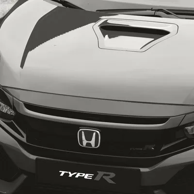
Japanese cars have historically earned white more consistently than their price points suggest they should. The Toyota GR86 in Halo White. The Honda Civic Type R in Championship White. Both cars have surface designs specific enough that white clarifies rather than exposes. The Type R in particular uses white as part of its visual argument. The aggressive aero elements, the wide arches, the complex hood surface. In white they read as deliberate engineering decisions rather than styling additions. The color is working for the design rather than simply covering it.
The Cars That Should Never Have Been Offered in White
Most crossovers. That's the honest answer. The upright greenhouse, the flat door surfaces designed for maximum interior volume, the wheel arches that prioritize clearance over visual tightness. White turns these design compromises into a checklist of things that didn't get resolved. A white Toyota Highlander looks like a large white appliance with wheels. The design was never intended to be inspected this closely and white inspects everything.
The Chrysler Pacifica in white is a particularly instructive case. Minivan design serves practicality first and visual appeal somewhere down the list, which is the correct priority. But white on a minivan removes the visual softening that a darker color would provide and leaves the buyer staring at a large white box with a sliding door. At least the silver version has some metallic movement. White just confirms what the Pacifica is without offering anything in return.
The BMW X7 in Alpine White is a car fighting itself. The front end, with its enormous kidney grilles, reads differently in white than in darker colors. Darker colors give the grilles visual weight that anchors them to the car. White makes them look like they're floating in front of a body that wasn't designed to support them. The same grille treatment that looks aggressive in black looks oversized in white because white removes the visual mass that dark colors provide.
Why White Wins and Loses Faceoffs Differently
In WhipJury faceoffs, white cars produce more polarized results than almost any other color. A well-designed car in a good white formula wins faceoffs convincingly because white's clarity reads as confidence. The car looks like it knows what it is. Voters respond to that certainty even without being able to articulate why.
A poorly designed car in white loses badly. The same voters who respond to white's clarity respond negatively to white's exposure. A flat-surfaced crossover in white against a well-designed sports sedan in a dark color isn't a close contest. The crossover in white is handing the faceoff to its opponent by making its design weaknesses impossible to miss.
There's also a photography variable. White cars are harder to photograph well than almost any other color. Overexposed highlights on a white body lose all surface detail. Flat light on a white car turns it into a shape with no information. Getting a white car to photograph the way it looks in person requires more attention to light direction and exposure than getting a dark car to look good, and most owner-submitted photos don't account for this. White cars get underrepresented in faceoffs at their actual quality level because the photos undersell them more consistently than any other color.
If your car is white and it's not winning faceoffs the way you think it should, the photo is probably the problem. Golden hour, slight underexposure to retain surface detail, a background with some tonal contrast so the white has something to read against. Get those three things right and a white car in a faceoff is a different proposition entirely.
The Test Worth Running
Pick any car you're considering buying and find it in white and in its darkest available color. Look at both for thirty seconds each. The dark version will almost certainly look better at first glance because darker colors are more immediately flattering to most body designs. Then look at the white version longer. If the surfaces are doing real work, the white version will start earning it. If the design is weak, the white version will look worse the longer you look.
That's the test. White is patient. It'll wait for the design to prove itself and it won't lie about the result.
Submit your white car on WhipJury and find out if the design earned the color.
Frequently Asked Questions

Jeffrey Wiley has spent more time than he'd like to admit thinking about what makes a car look right. He writes about automotive design, car culture, and the opinions people have strong feelings about. He lives in north Georgia.